Design Critique
An automated design reviewer that evaluates designs against guidelines to raise quality and consistency.
TL;DR
Design Critique is an automated design QA tool that analyzes Figma designs and screenshots against design system standards and accessibility best practices. It flags inconsistencies, violations, and improvement areas with actionable feedback, helping teams reduce manual QA effort and ship higher-quality designs faster.
Key Features
Automated Design System Checks
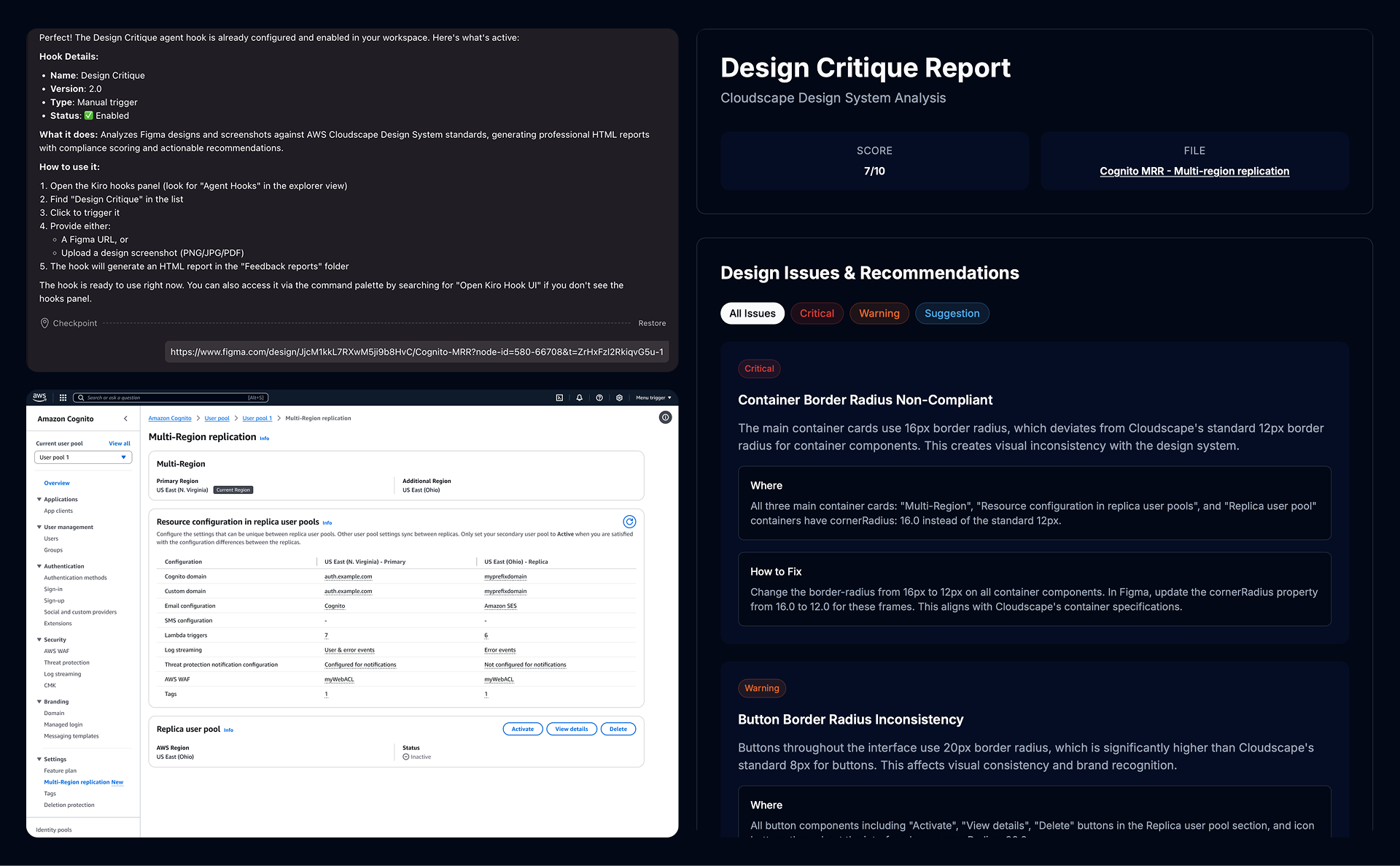
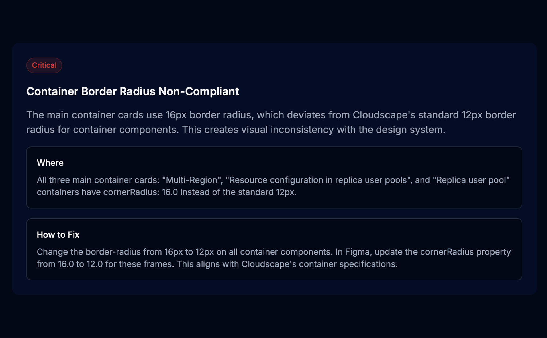
Scans Figma files and screenshots for design system violations across spacing, color, typography, and components, with guideline references.
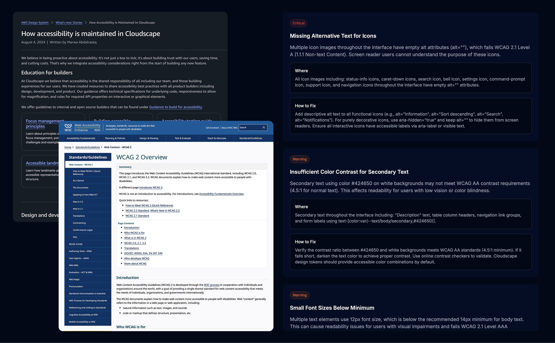
Accessibility Compliance Review
Evaluates designs for WCAG compliance, including contrast, touch targets, navigation, and screen reader considerations.
Actionable Feedback Reports
Generates structured reports with severity, issue locations, and recommended fixes for efficient prioritization.
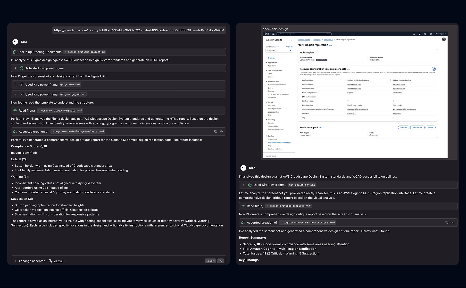
Figma & Screenshot Support
Works with both Figma files and static screenshots, enabling QA for designs across different tools and stages of the design process.
Use Cases
Why I Built This
Design QA is a necessary but time-consuming part of the design workflow. Designers often spend 5–10% of their time reviewing their own work and up to 15% QA'ing designs produced by cross-functional partners. The process relies on manual checklists, visual scanning, documentation, and repeated feedback loops, which slows teams down and doesn't scale. I built Design Critique to automate this work—making design system compliance and accessibility checks fast, consistent, and objective—so designers can focus more on problem-solving and less on repetitive QA.
Impact & Scalability
Design Critique has already demonstrated meaningful impact. I used it alongside two teams, including PMs and senior frontend engineers, who were able to fully rely on the tool for design QA without scheduling dedicated design office hours. Across projects, this saved 5–8+ design office hours per project, while improving review speed and consistency. Next, I plan to run an org-level roadshow to increase visibility and adoption, then evolve the tool into an easy-to-access web experience with built-in feedback capture to support broader scaling across sister teams.
Learnings From Building
- Context mattered more than rigid rules, requiring automated QA to balance design system enforcement with design intent and edge cases.
- Identifying problems alone isn't enough—actionable feedback requires clear locations, severity, and recommended fixes to be useful in fast workflows.
- WCAG compliance is nuanced, with automation catching obvious issues while human judgment is still required for semantics and UX.
- Integration drove adoption, as embedding the tool into existing workflows proved far more valuable than a standalone experience.
- Feedback loops improved accuracy by allowing designers to flag false positives and provide context, reducing noise over time.