Clarity
Analyzing UI copy to identify clarity issues and guideline violations.
TL;DR
Clarity is a lightweight Kiro agent hook that detects Figma links or screenshots and automatically reviews UI copy. It checks clarity, tone, grammar, and microcopy against your content guidelines—reducing the need for manual review with a tech writer or UX writer.
Key Features
All It Takes Is a Figma Link
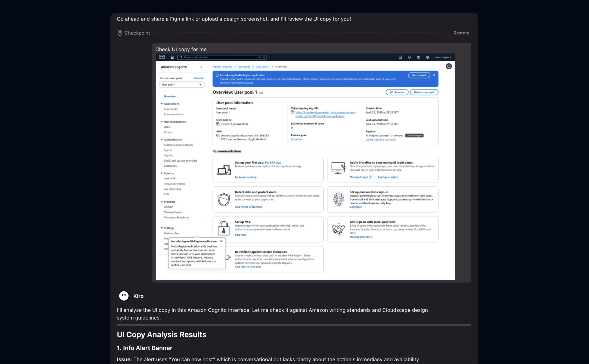
Clarity makes content checks simple: paste a Figma link and it analyzes everything in the design via MCP.
Supports Screenshots Too
Clarity can also analyze UI copy from screenshots and flag issues.
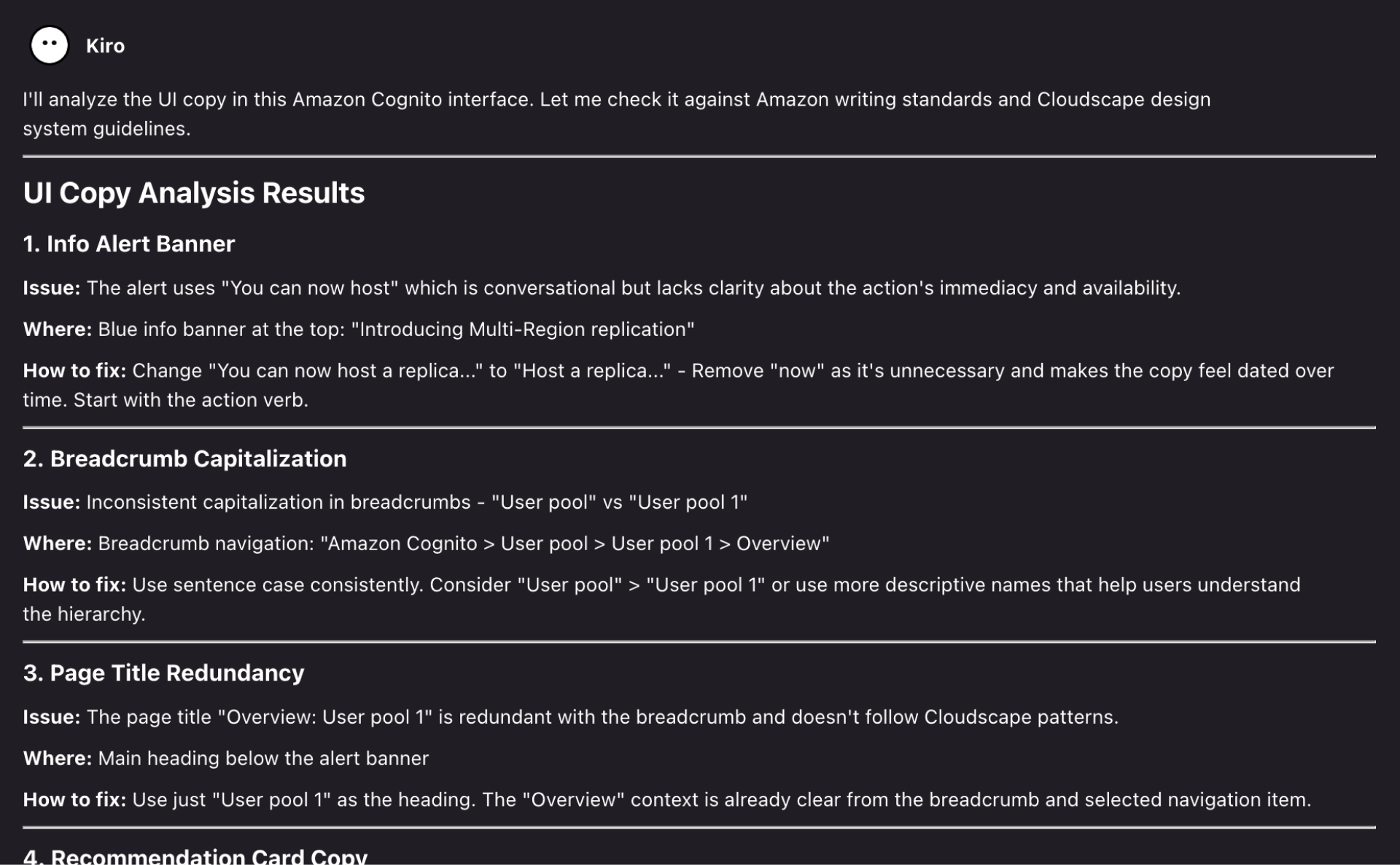
Clear and Concise
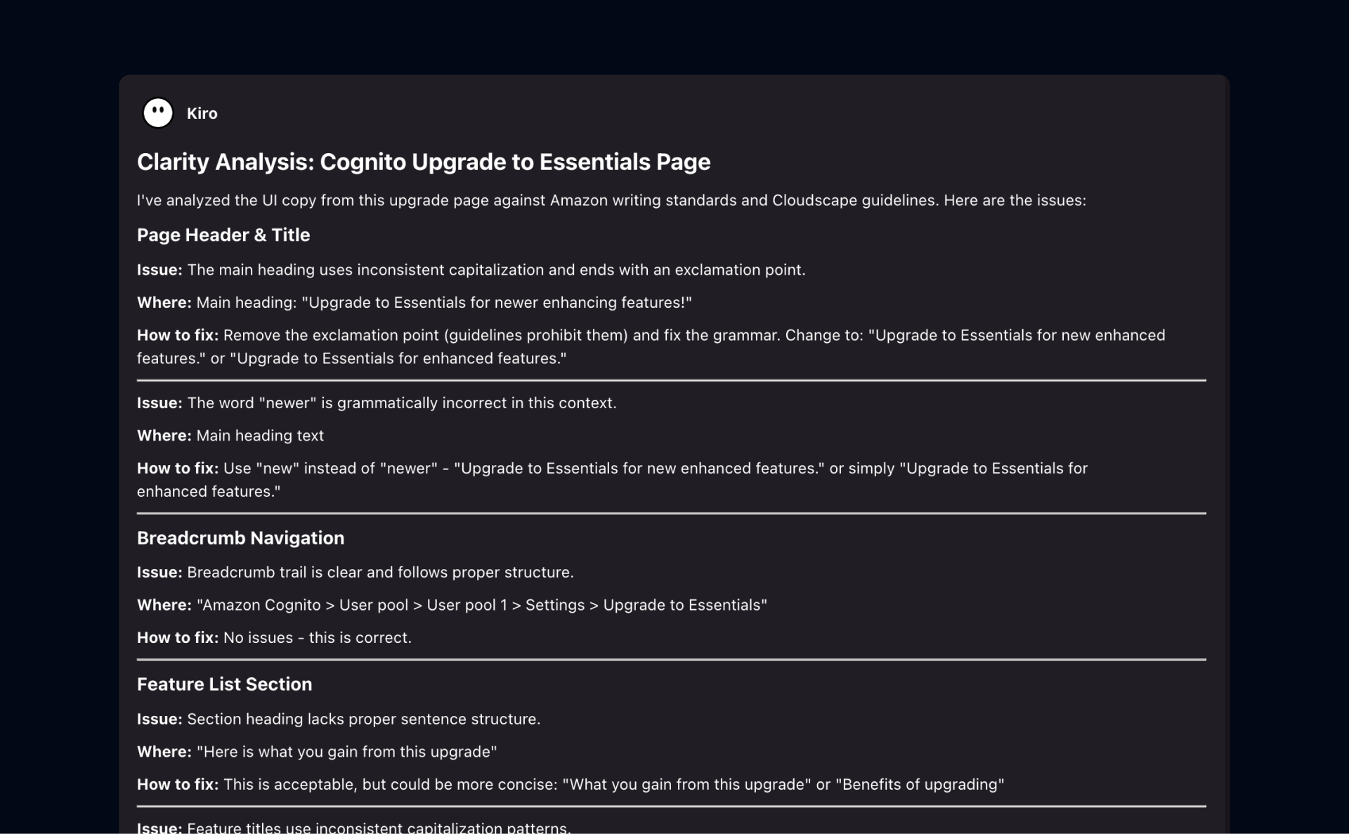
Clarity outputs feedback in a clear What / Where / How format.
Content Guideline Selections
Easily switch the content guideline you want to check against.
Use Cases
Why I Built This
I built Clarity to remove the friction from UI copy review. Copy issues like unclear labels, inconsistent terminology, and tone mismatches are easy to miss in fast-moving design cycles, and they often surface too late during handoff or QA—costing time across design, product, and engineering. Not every team has a UX writer available for every iteration, so Clarity provides instant, guideline-based feedback directly from a Figma link or screenshot. It also saves time for cross-functional partners by reducing the need for design office hours. Clarity turns subjective comments into clear What/Where/How actions, helping teams ship cleaner, more consistent copy with less rework.
Impact & Scalability
Clarity has shown strong early impact and clear scalability potential. I presented multiple live demos during an org-level roadshow to product teams and cross-functional partners, and the response was consistently enthusiastic—many expressed relief given the limited availability of tech and content writers across the org. Several teams have already piloted the tool and shared constructive, insightful feedback, validating both the need and the direction. This is a strong foundation to iterate from. Next, I plan to expand Clarity into a web app to make access frictionless, scale adoption across the org, and potentially extend it to sister orgs.
Learnings From Building
- Speed mattered more than perfection, because fast feedback loops drove real adoption.
- Designers wanted guidance and options, not full rewrites of their UI copy.
- Consistency was a team-wide issue, and guideline checks reduced terminology drift.
- Structured output built trust, and the What / Where / How format improved actionability.
- Low input friction was key, and Figma links + screenshots removed setup overhead.
- Cross-functional usability scaled impact by giving PMs and engineers self-serve capabilities.
- Copy quality depended on context, so clear and specific content guidance mattered most.